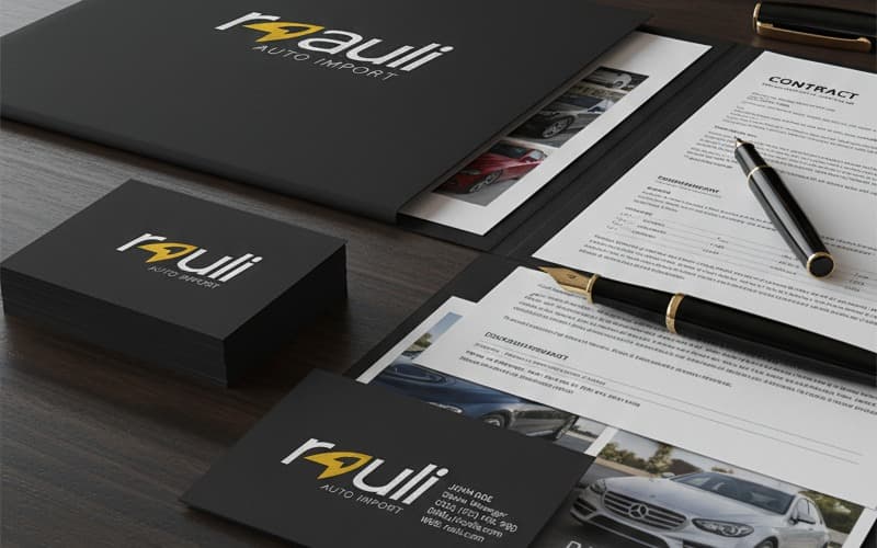
Business cards
The object people touch the most and the one most often botched. Files prepared for finishes you can feel.
- Matte
- Gloss
- Spot UV
- Emboss

I blend technology, creativity and logic to build brands with real weight.
The «from» is the floor for each branch. The final price comes from your project's real scope — you get it in writing before we start.
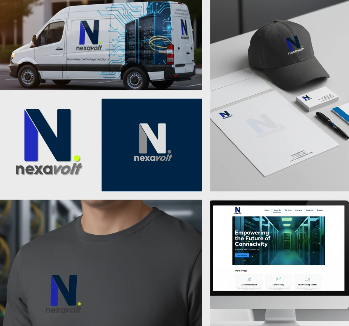

Before investing in advertising or content, the brand has to actually exist: a visual system that is defined, documented and applied consistently. These four steps are the order I build it in.
Three logo concepts with strategic reasoning behind each — not three versions of the same drawing. The chosen one yields every variant and the official palette in Pantone, CMYK, RGB and HEX.
The document that keeps the brand from drifting every time someone new touches it: correct and incorrect usage, type hierarchies, spacing and voice.
The brand applied to every platform the client already lives on, with bios written to be found and to convert — not just to describe.
The first site of their own: four pages with the identity already applied, a form that actually works, and the technical basis for Google to find it.
Print production with professional press finishes, coordinated end to end: I prepare the files with the brand already applied, supervise the color proof and manage production through my supplier network.
The object people touch the most and the one most often botched. Files prepared for finishes you can feel.
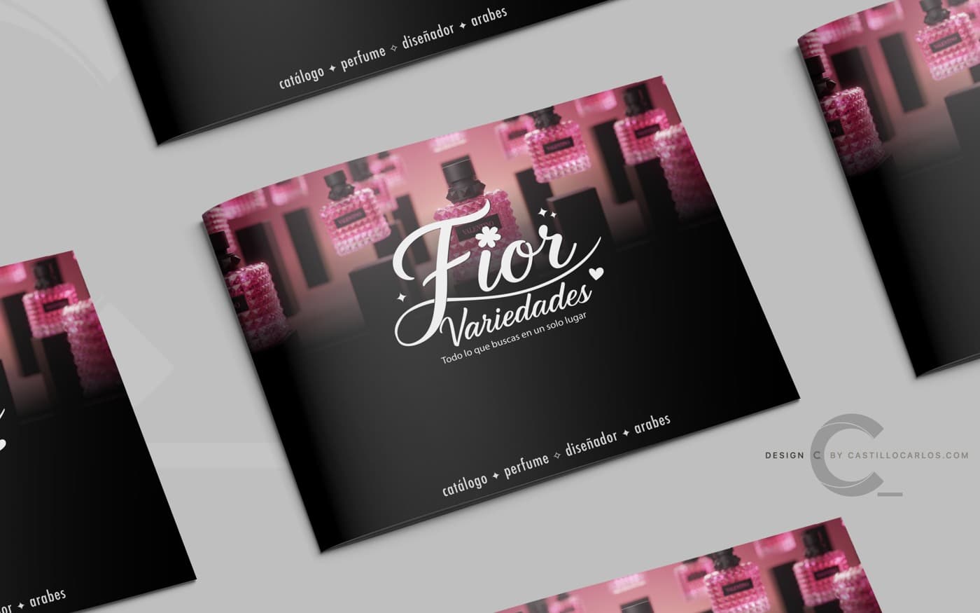
Folded and bound promotional material, built for point of sale and campaigns with a release date.
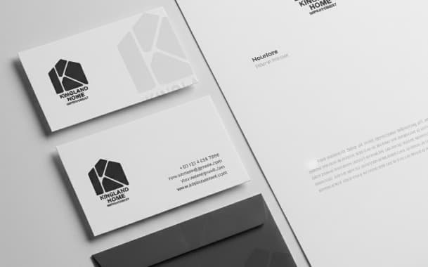
Letterheads, envelopes and folders aligned to the brand manual, so print and digital read as one thing.
A 30-minute conversation is enough to know whether you need identity, a site, campaigns, or all three. If the project isn't a fit for me, I'll say so and point you somewhere useful anyway.